.svg)
Write us >info@njudesign.com
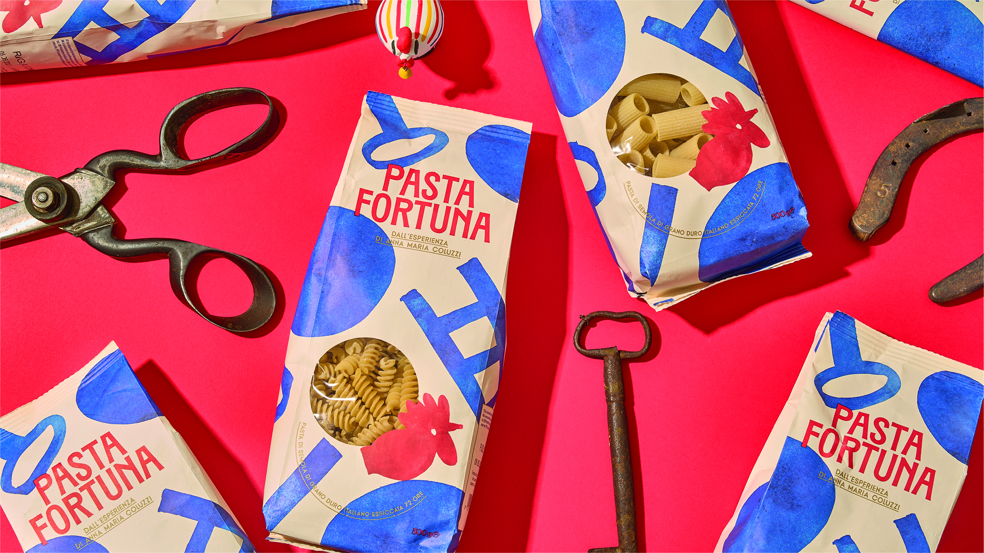

For Pasta Fortuna, we developed a visual identity rooted in the folk culture of Basilicata and Southern Italy. The project translates a rich heritage of rituals, symbols and superstitions into a contemporary graphic language, balancing the warmth of family traditions with a more playful and current approach.
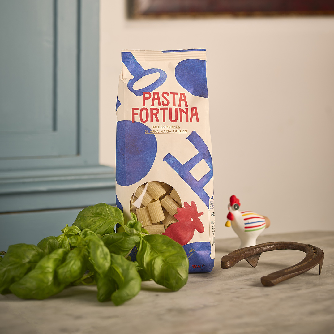
The name brings together the product and one of the most deeply rooted elements of Southern Italian culture: superstition and good-luck rituals. Pasta Fortuna is an immediate, familiar and positive name that captures the essence of the project in two simple words — its connection to the territory and the world of gestures, symbols and rituals that shapes the entire visual language. Starting from the name, we explored gestures, objects and rituals traditionally associated with good fortune: everyday amulets and symbols passed down through generations. The rooster, the key and the ladder became the core elements of the identity, forming a distinctive and cohesive system of signs.

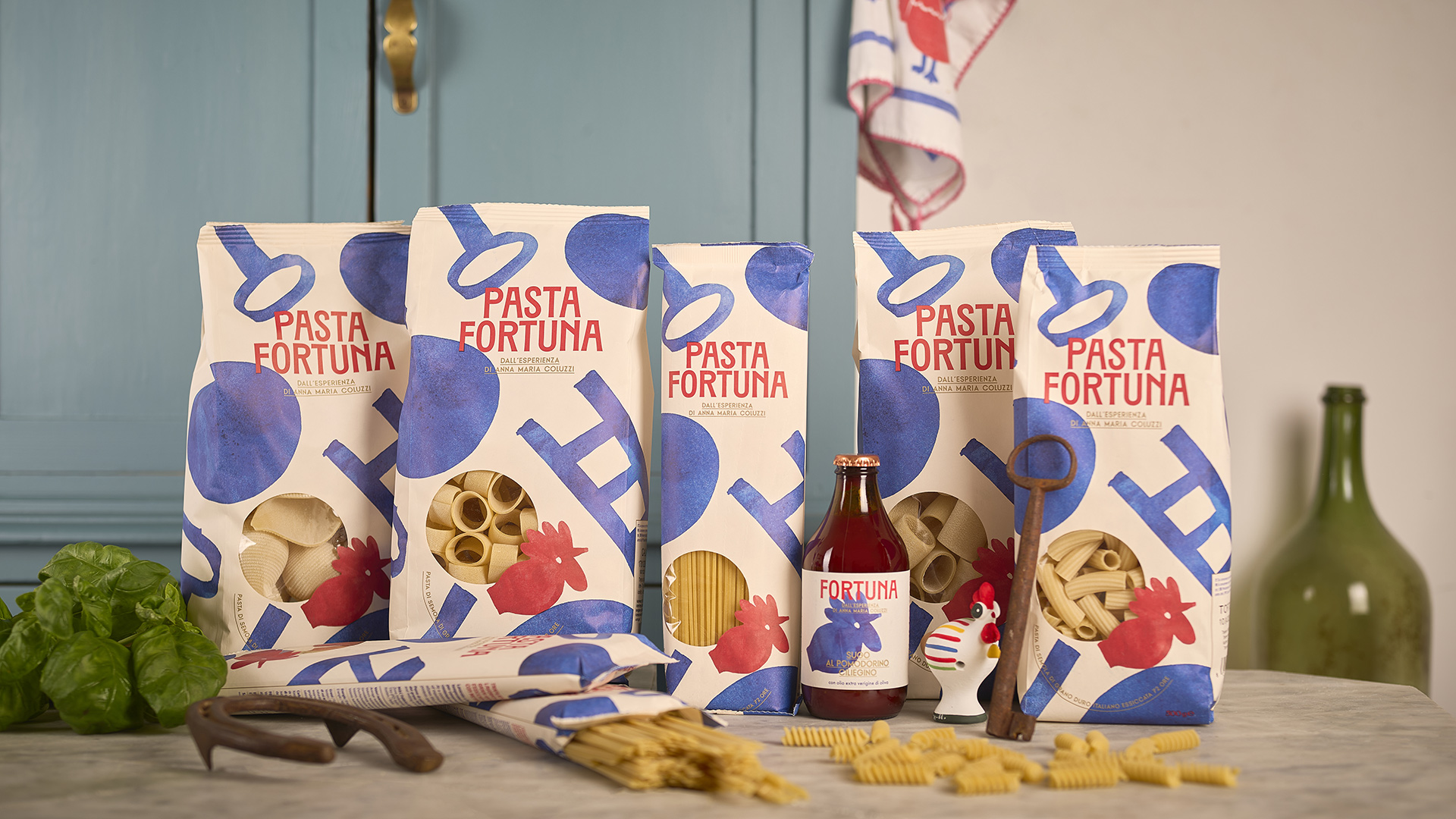
We translated these symbols into a series of flat, gestural illustrations, reducing them to their most essential forms. The rooster draws inspiration from the Cucù of Matera, a traditional terracotta whistle associated with the sun and good fortune. The key becomes a symbol of protection, while the ladder plays on the ambiguity between good and bad luck. The resulting forms move between folk iconography and contemporary graphic symbols, creating a visual language that can work consistently across the entire packaging system.

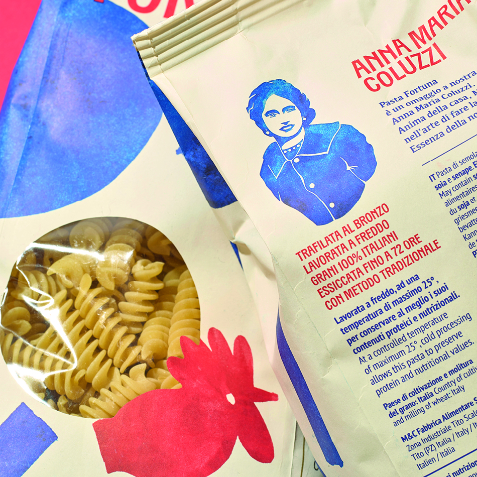
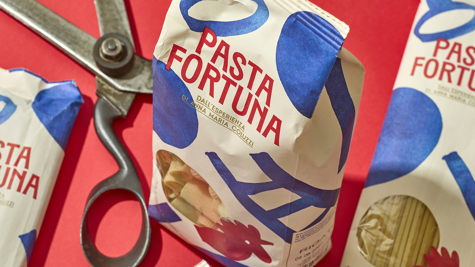
The visual language deliberately avoids a nostalgic representation of Southern Italian culture. Bold colours, simple shapes and an almost tactile quality give the packaging a contemporary and playful character.
Portrait of Anna Maria Coluzzi: Claudia Bartoli
Photography: Antonio Alaimo