.svg)
Write us >info@njudesign.com
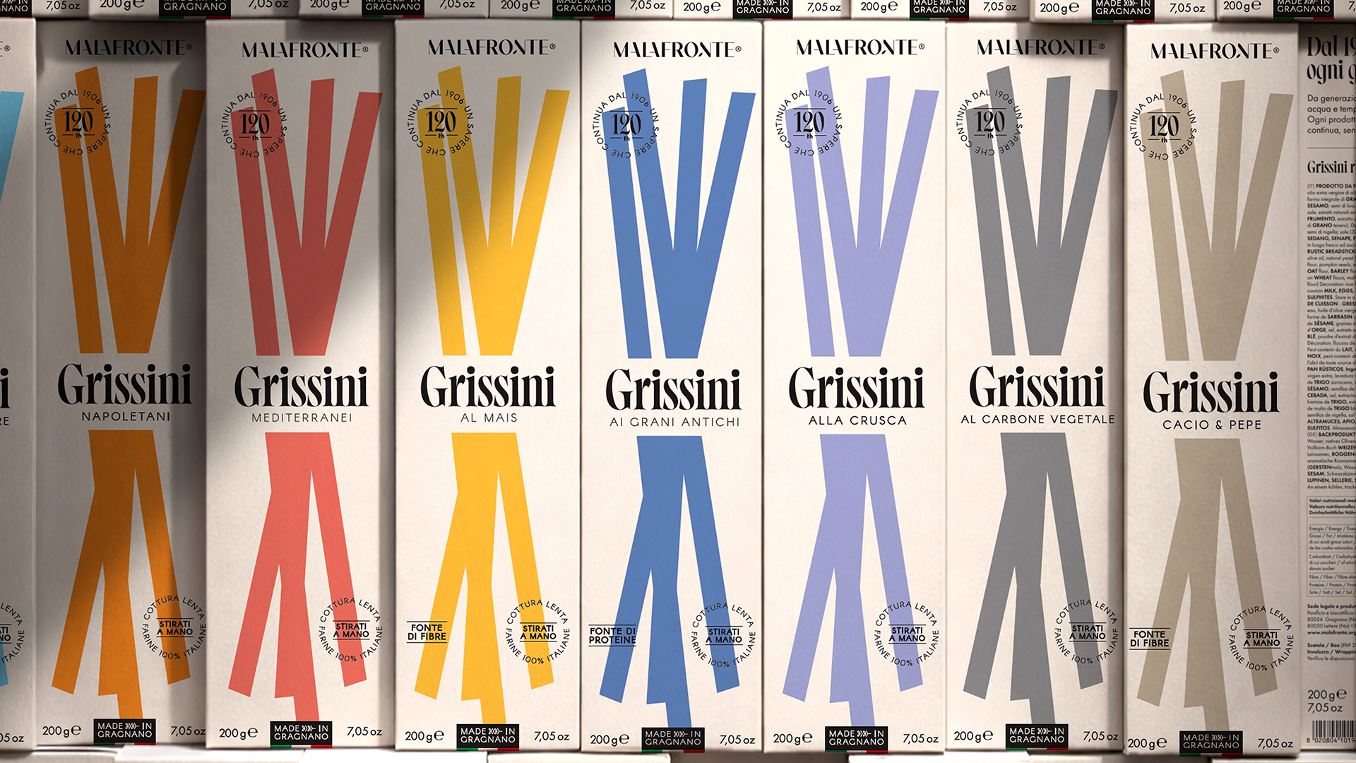
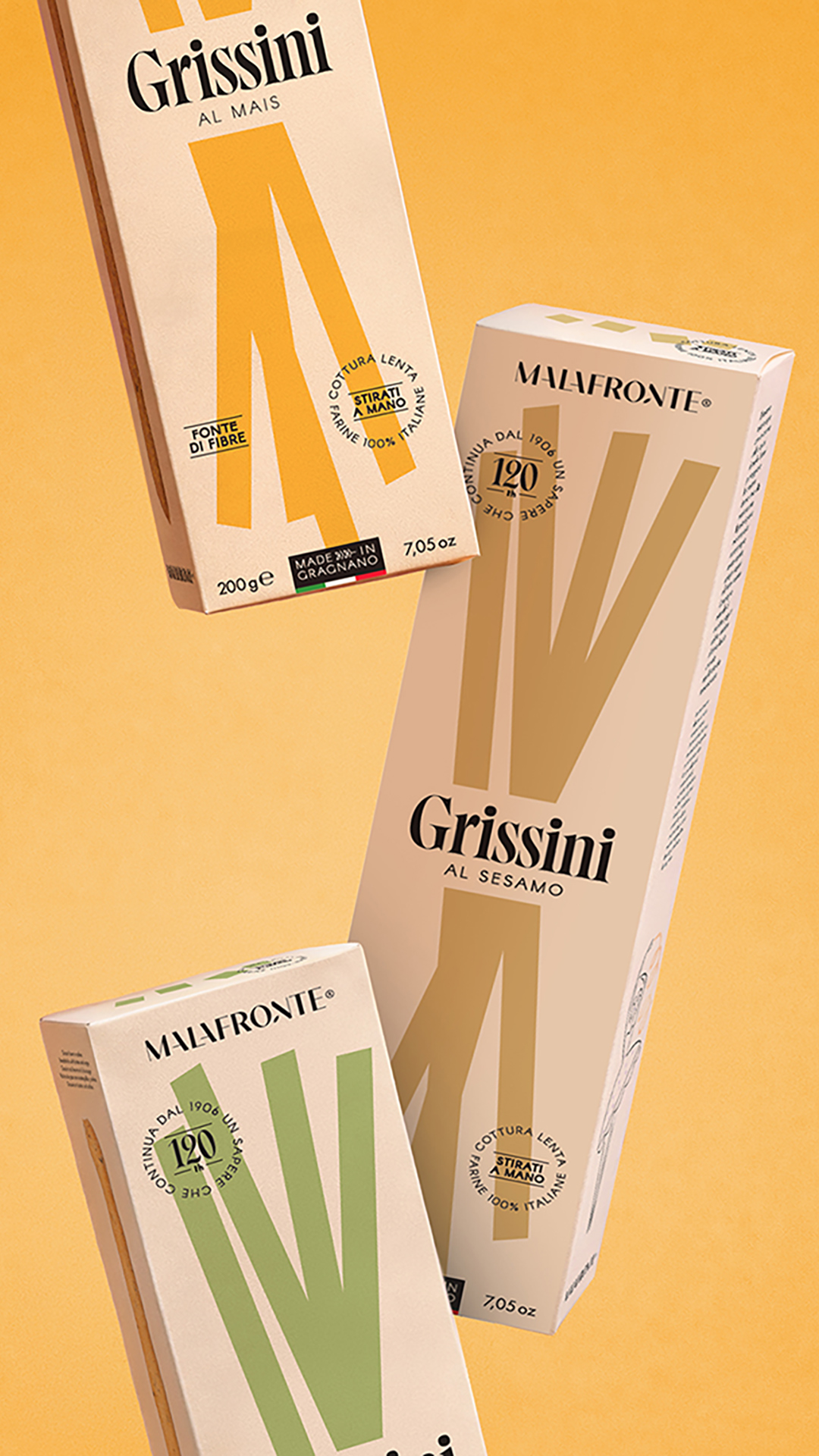
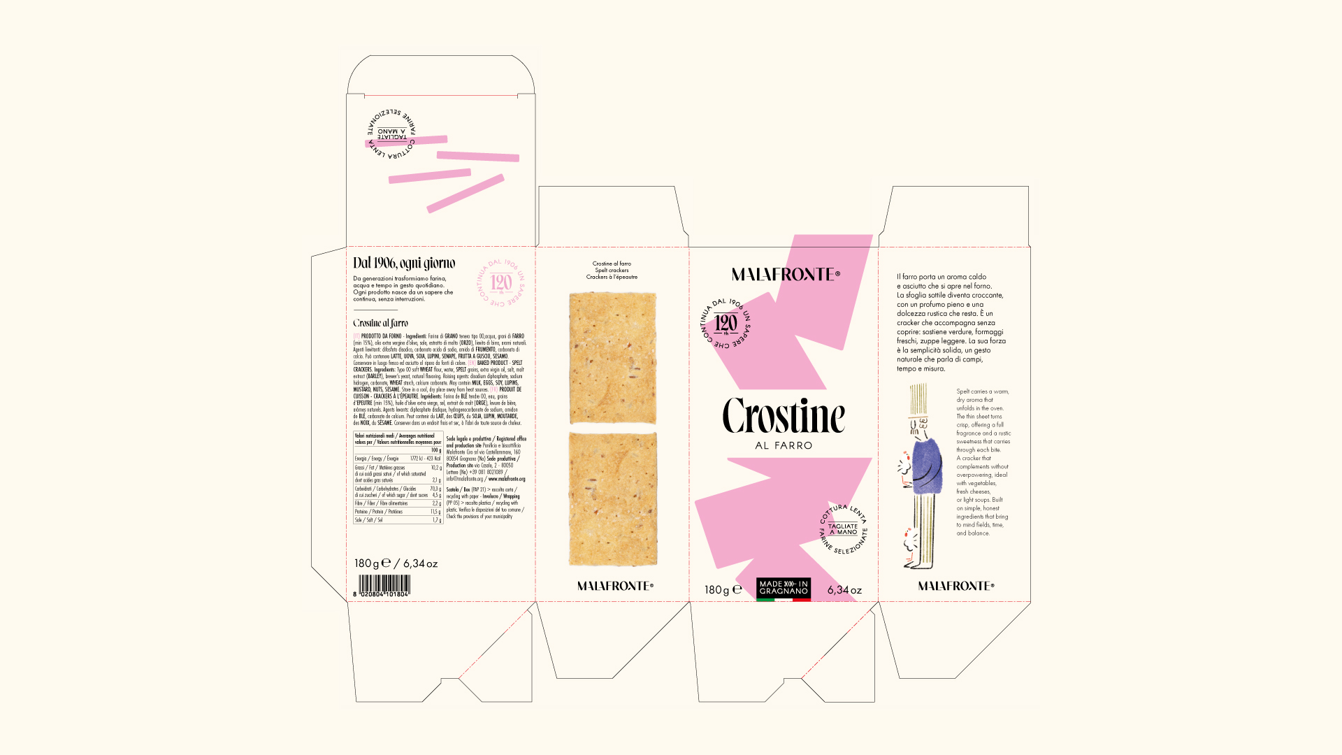
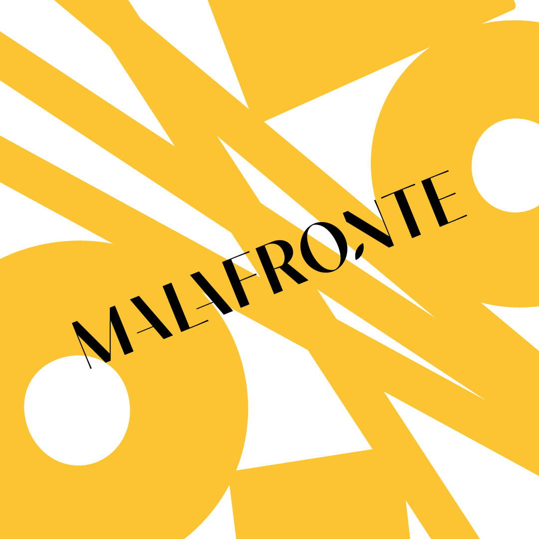
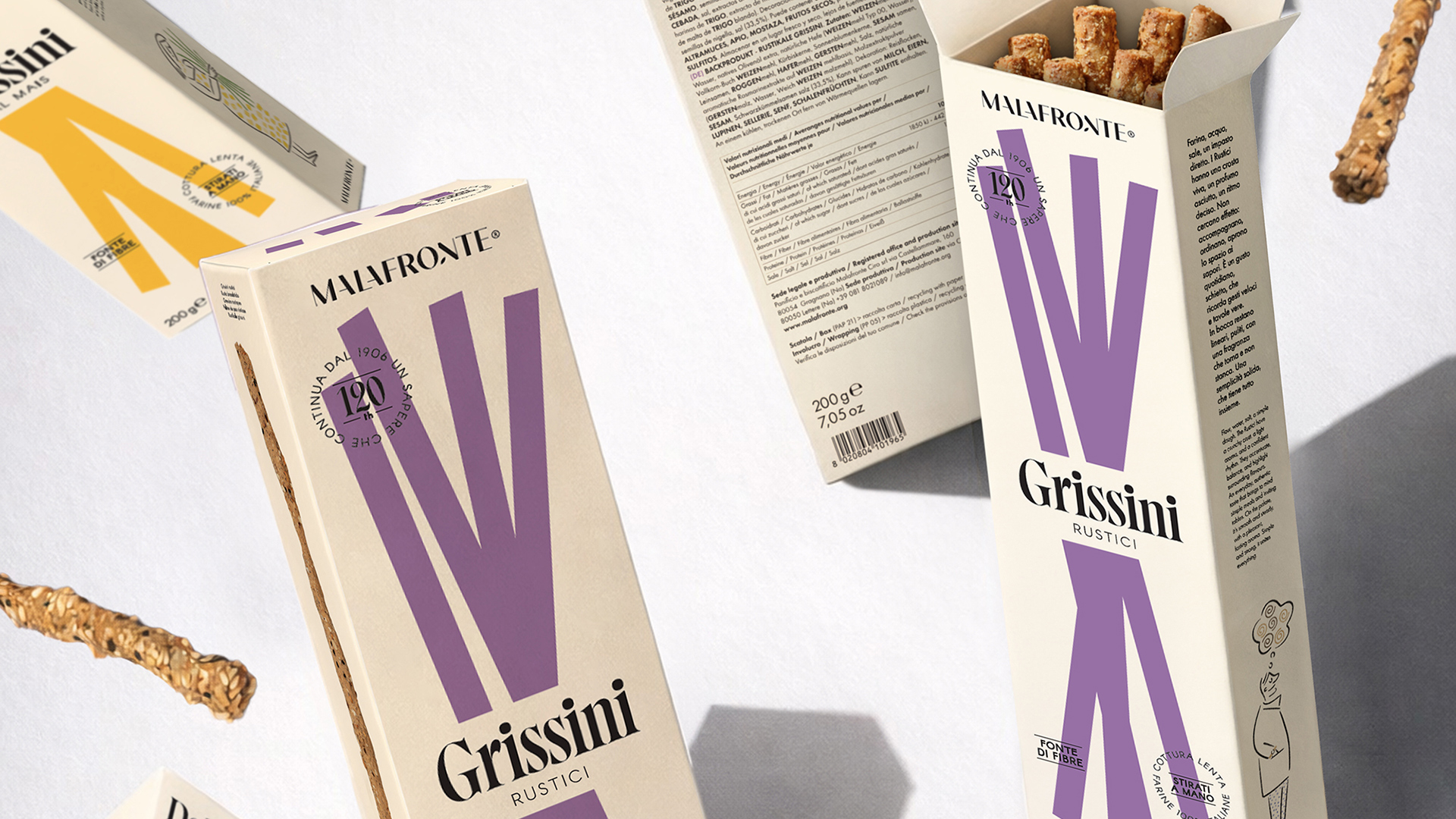
For Malafronte, we developed a brand repositioning and visual identity project that brings the brand’s heritage into a contemporary visual language. Starting with a redesigned logo, the new identity takes shape across the breadstick range, where colours, graphic elements and illustrations come together to create a cohesive and recognisable visual world.
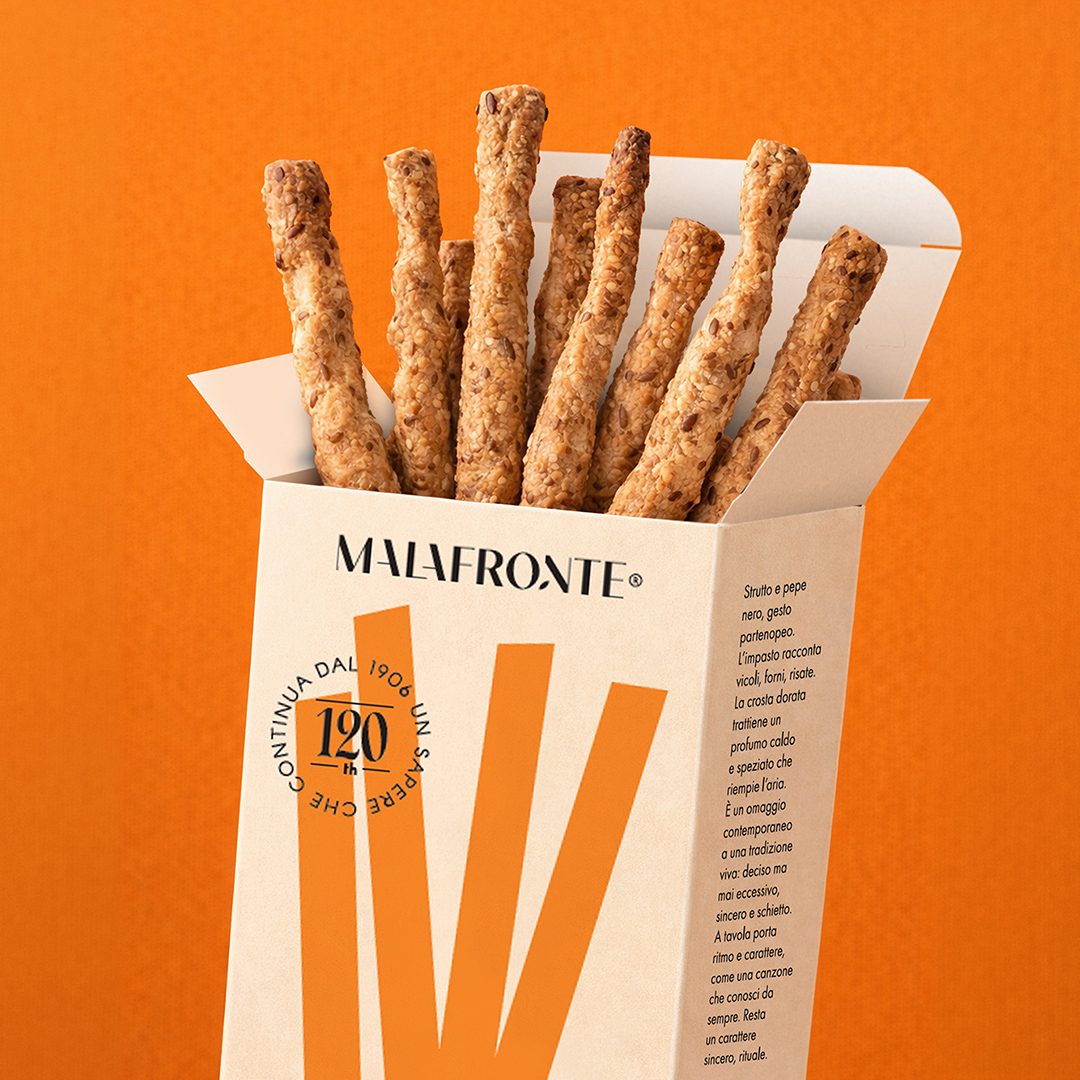
The product takes centre stage in the packaging design, reinterpreted through simple geometric shapes, cross-sections and photography. First developed for the breadstick range, this visual approach extends to other products, including taralli and crostini, creating a consistent and recognisable graphic system. Colours and shapes distinguish each variety, while the packs can be rotated, arranged side by side or stacked to create different compositions on display.
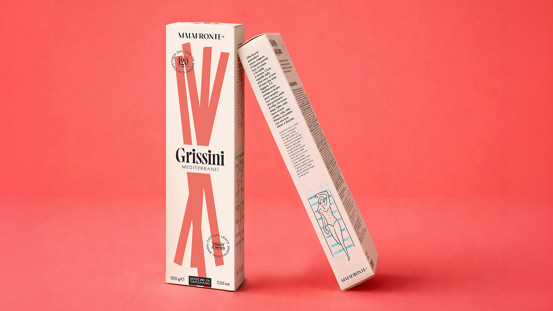
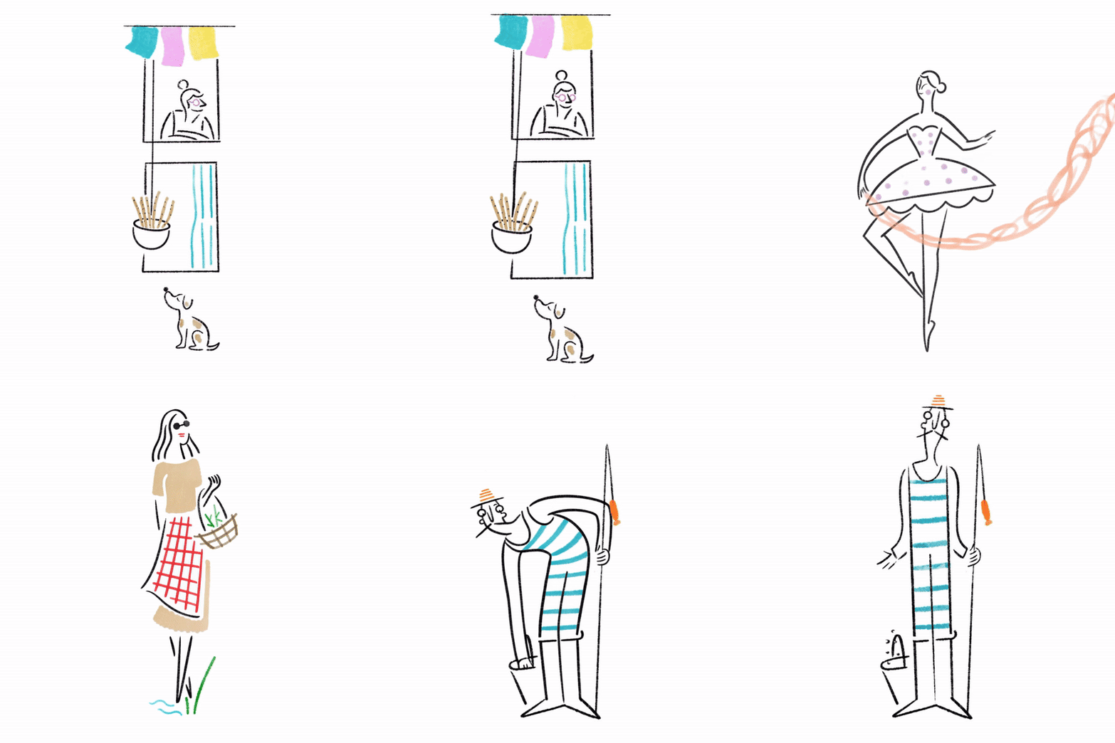
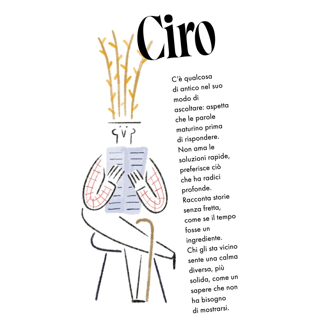
The visual narrative takes on a more human and playful dimension through characters illustrated by Antonio Bianchino. Each character reflects the personality of a particular recipe, giving every variety its own distinctive identity and contributing to a lively visual language that brings together product, branding and storytelling.

Animazioni: Salvatore Illeggittimo
Illustrazioni: Antonio Bianchino