Write us >info@njudesign.it
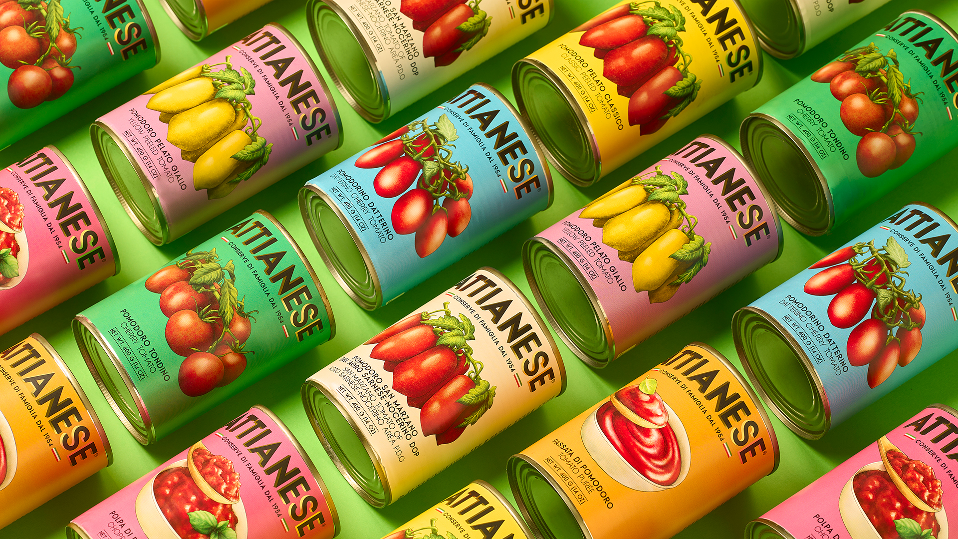
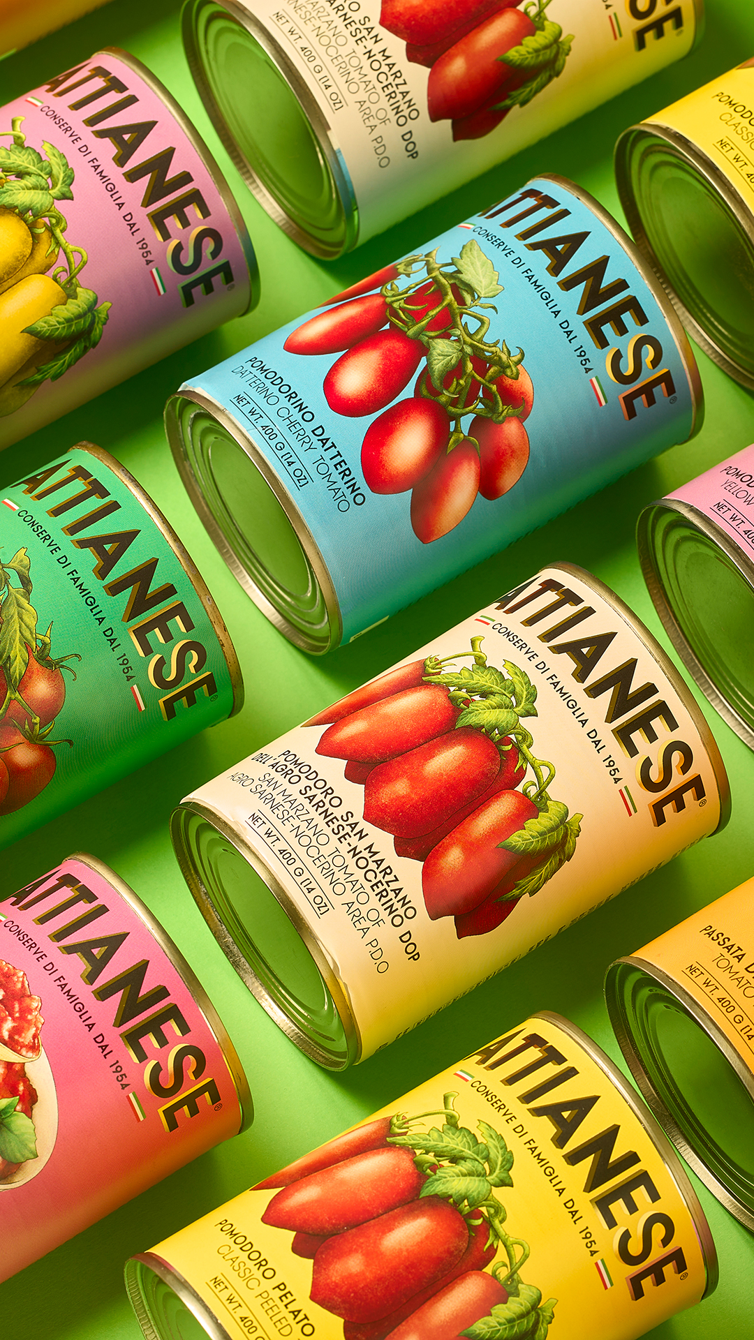
The packaging for Attianese Conserve 1954 stems from the study of the old labels of the Campania canning companies that, from the 1950s onwards, exported tomatoes all over the world. The aesthetic is inspired by that visual imaginary, made up of collective memory and graphic codes typical of the time, and reinterprets it with a current perspective. The result is a project that combines design and identity, giving the product an authentic, artisanal and contemporary image.

The idea starts from the iconography of the bell labels of the 1950s: lively packages, illustrated by hand, full of ornaments and bright colors. They were often signed by local illustrators and told about a productive world that is almost forgotten today. This is where the project came from: observation, research and respectful reinterpretation of that visual universe. No forced nostalgia, but a sincere synthesis between past and present.


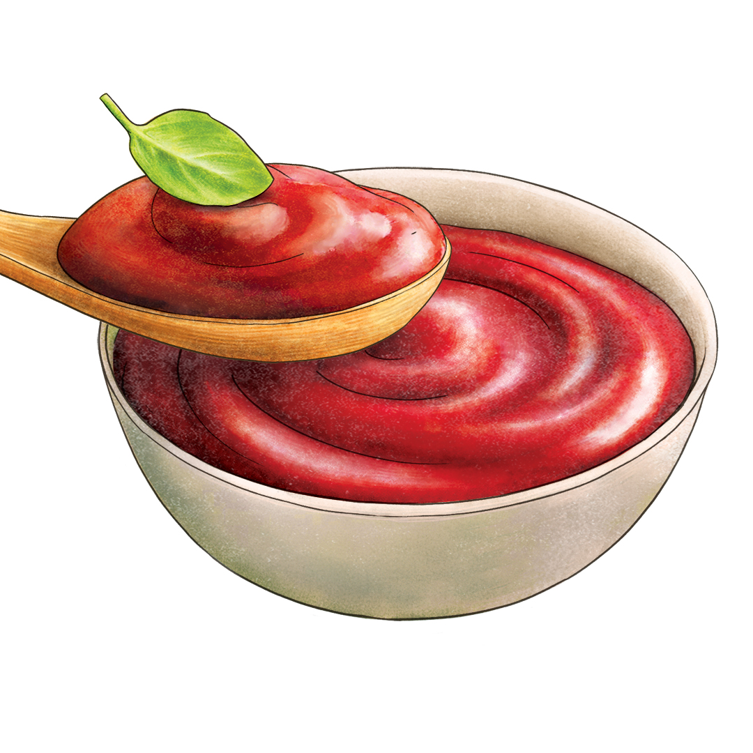
The tomatoes and the other graphic elements have been redesigned with simple and decisive lines, inspired by the style of illustrations before the photographic era. The original illustrations are by Claudia Bartoli, who created essential but expressive images, capable of evoking timeless beauty.
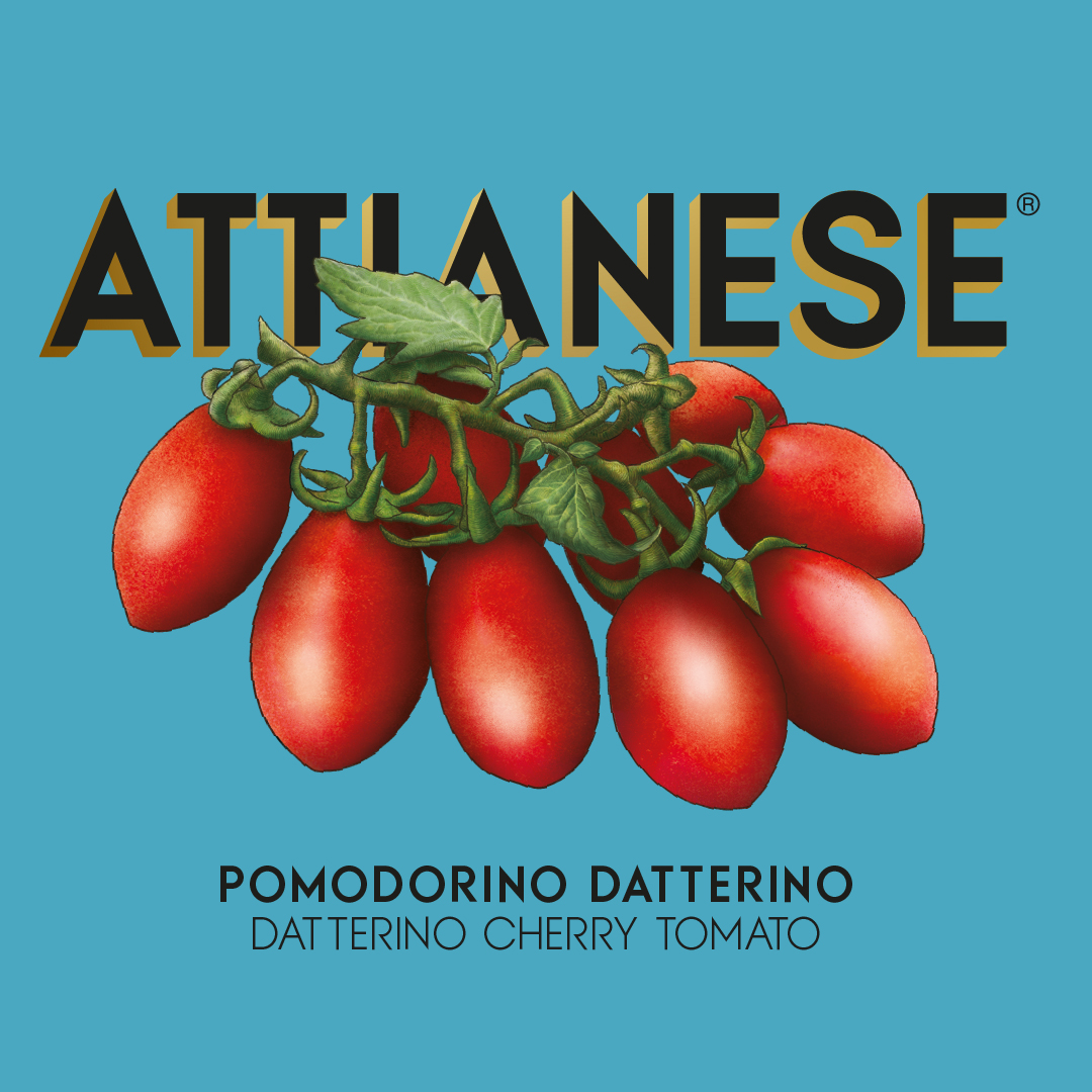
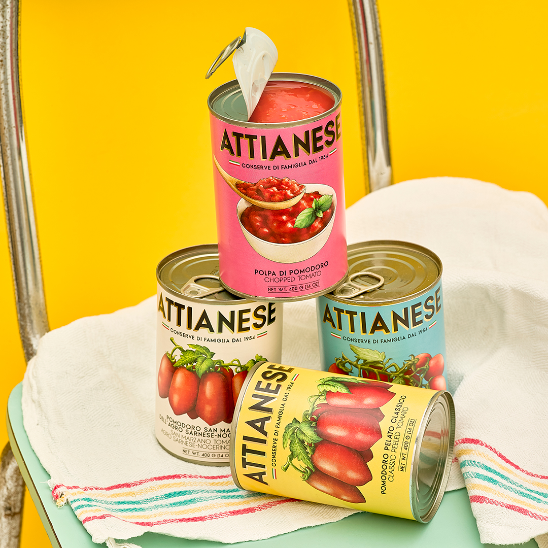

Color plays a key role: full, saturated and vibrant tones, reminiscent of old post-war lithographs and labels. Revised in a modern key, they maintain a strong visual impact. In this balance between past and present, the soul of the project is reflected: to tell a tradition with a current language.
illustrations: Claudia Bartoli
photographs: Antonio Alaimo